Thank you! Your PDF is on the way! Check your Email for a link.
Thank you! Your submission has been received!
Oops! Something went wrong while submitting the form.
SEO & Optimization
Web Design
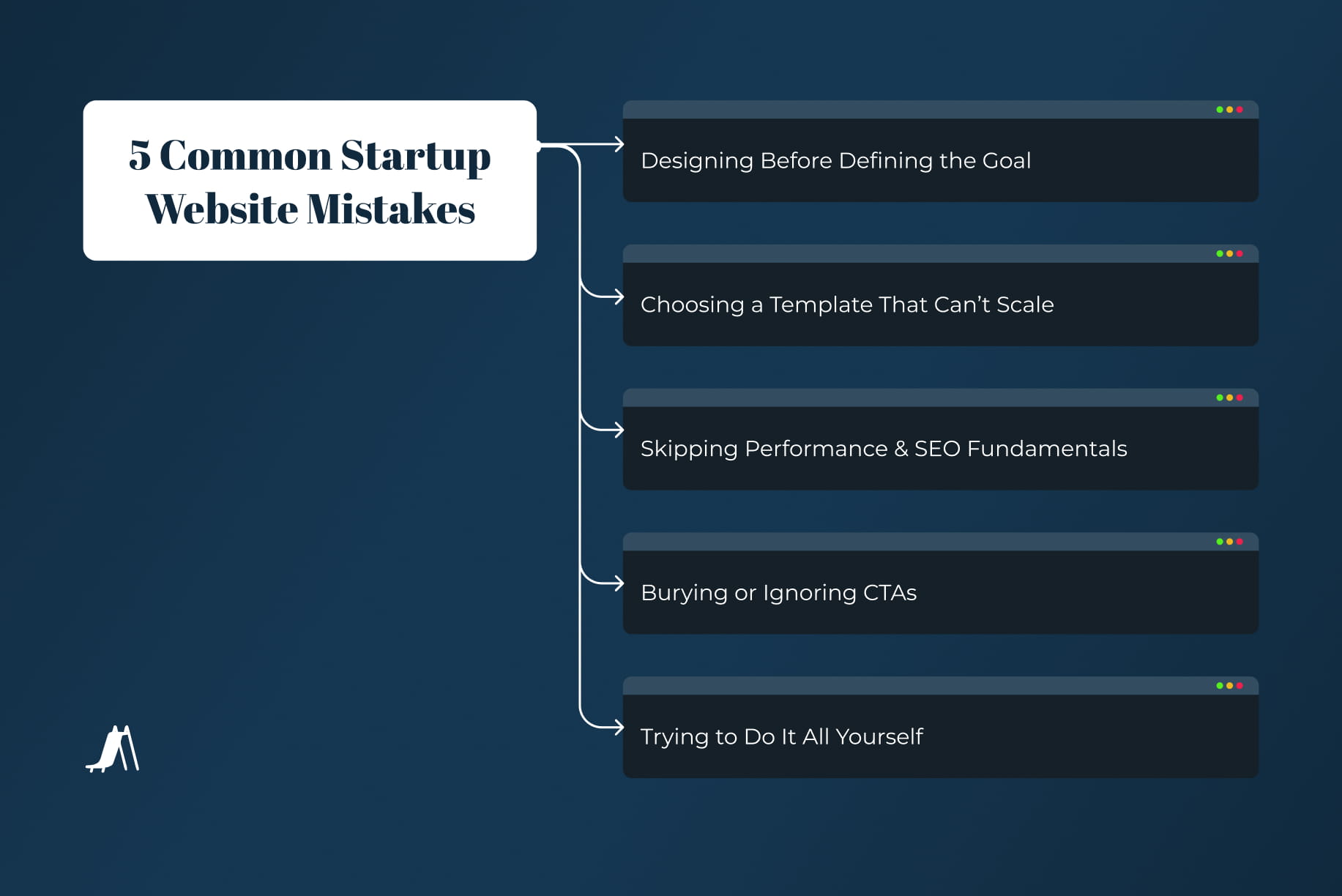
5 Common Startup Website Mistakes (and How to Avoid Them for Faster Growth)
Many startups unknowingly sabotage growth with poor website strategy. This guide covers five common web design mistakes and shows how to avoid them using scalable platforms, smart SEO, and expert planning to build a high-performing site that drives business forward.
The Real Cost of a Bad Website: Don't Let Your Digital Front Door Become a Dead End
"Most startups rebuild their website within the first year—often because they rushed the first version."
This isn't just a statistic; it's a common, painful truth for small businesses and digital agencies. You launch with excitement, a fresh idea, and a website that feels "good enough." But within months, you realize "good enough" is crippling your growth. Your momentum stalls, your credibility takes a hit, and those valuable leads you desperately need simply aren't materializing.
Your website isn't just an online brochure; it's your digital storefront, your 24/7 sales team, and the cornerstone of your online presence. When it's not performing, it's not just costing you potential revenue; it's costing you time, energy, and the very future of your business. The good news? These pitfalls are largely avoidable.
Let’s walk through five common mistakes we’ve seen over and over again. Like mistakes that turn your website from an asset into a liability. And, more importantly, how to build smarter from the start, focusing on SEO and creating a highly engaging, conversion-oriented platform. We'll even explore how innovative, codeless solutions like Lovable and other no-code website builders can empower you to create a powerful online presence without getting bogged down in complex development.
1. Designing Before Defining the Goal: The Pretty Face with No Purpose
Common mistake: Many businesses jump straight into design. They pick a sleek template, choose beautiful fonts, and load up on captivating imagery. The focus is entirely on aesthetics.
Why it matters: A visually stunning website is great, but if it doesn't serve a clear purpose, it’s nothing more than an expensive digital art piece. It might look fantastic, but if visitors don't know what to do or where to go, they'll leave without converting. Think of it like a beautiful, well-designed store with no clear signage or checkout counter.
What to do instead: Before you even think about colors or layouts, define your website's primary goals. What do you want visitors to do when they land on your site? Are you aiming for:
Lead generation? Then every page should funnel users towards a contact form, a consultation booking, or a downloadable resource.
E-commerce sales? Your product pages, shopping cart, and checkout process need to be seamless and intuitive.
Information dissemination? Your content needs to be easily discoverable and shareable.
Once you have your core goals, map out the user journey. How will a visitor arrive? What information do they need? What is the most logical next step you want them to take? This means prioritizing your Call to Actions (CTAs). Your CTAs should be crystal clear, prominently placed, and consistent with the intended action.
Pro tip: Run the “5-second test” on your homepage. Show your homepage to someone for just five seconds, then ask them:
What is this business about?
What product or service do they offer?
What should I do next?If they can't answer these questions clearly, your website isn't communicating its purpose effectively.
2. Choosing a Template That Can’t Scale: The Digital Growth Spurt Disaster
Mistake: Many small businesses, in an effort to save money or time, opt for the cheapest, most basic template they can find. A $30 template might work perfectly when you have three pages. But what happens when your business grows, you add ten more services, start a blog, and need a client portal?
Symptoms: This mistake often manifests as:
Limited CMS (Content Management System): You find yourself wrestling with a clunky interface that makes simple content updates a nightmare.
No modularity: Every new page feels like starting from scratch. You can't easily reuse elements or layouts, leading to inconsistent design and endless customization woes.
Hard to hand off to developers: If you eventually need professional help, a poorly structured template means developers have to unravel a spaghetti code mess, significantly increasing costs and time.
Better path: Invest in a component-based system from the start, even if you’re using a codeless solution. Platforms like Lovable, for example, are designed with modularity in mind. While Lovable shines in AI-powered app generation, its underlying principles of generating clean, editable code and supporting full-stack development extend to website creation. This means you can build a site that is inherently flexible and scalable. Other modern AI website builders like Webflow, Squarespace, or even the more advanced capabilities of Wix and Shopify, offer robust component libraries and flexible design systems. These allow you to:
Build with reusable blocks: Create sections, headers, and footers that can be easily duplicated and customized across your site, ensuring consistency and saving time.
Manage content efficiently: A well-designed CMS allows your team to update product descriptions, blog posts, and service details without needing a developer for every tweak.
Ensure future-proofing: When your business inevitably grows, your website won't buckle under the pressure. It can expand with your needs, accommodating new features, content, and integrations.
Think of it as building with LEGOs instead of play-doh. With LEGOs, you can add new pieces, reconfigure, and build something entirely new without destroying the foundation.
3. Skipping Performance & SEO Fundamentals: Invisible in a Crowded World
Mistake: You've got your beautiful website, launched it, and now you wait for the traffic to roll in. But it’s slow, bloated with unoptimized images, and its underlying structure is a mess for search engines.
Risk: This is a silent killer of online success.
Lost traffic: Slow loading times kill user experience. Studies show that a delay of just one second can lead to a 7% reduction in conversions. Google also prioritizes fast-loading sites.
Poor rankings: Search Engine Optimization (SEO) isn't an afterthought; it's fundamental. If your site isn't structured for search engines to understand, you won't rank for relevant keywords, meaning potential customers will never find you.
Low mobile usability: With the majority of internet traffic now coming from mobile devices, a site that isn't responsive and easy to navigate on a phone or tablet will alienate a huge segment of your audience. Google's mobile-first indexing means this isn't optional; it's essential for visibility.
Fix: Integrate performance and SEO best practices from day one, regardless of whether you're coding from scratch or using a codeless solution. Modern platforms are increasingly incorporating these features, but you still need to be aware.
Optimize load time:
Image compression: Use tools to compress images without sacrificing quality.
Lazy loading: Only load images and videos when they are visible to the user.
Minimize code: Ensure your chosen platform outputs clean, efficient code. Codeless solutions like Lovable aim for this by generating performant code from your prompts.
Page structure (On-page SEO):
Keyword research: Identify the terms your target audience uses to find businesses like yours.
Header tags (H1, H2, H3): Use them logically to structure your content and include keywords.
Compelling content: Create high-quality, relevant content that answers user questions and provides value.
Metadata:
Title tags: Craft unique, keyword-rich titles for each page.
Meta descriptions: Write compelling summaries that encourage clicks from search results.
Alt text for images: Describe images for accessibility and provide context for search engines.
Mobile-friendliness: Ensure your design is fully responsive and looks great on all devices. Most reputable codeless builders offer this as a standard feature, but always double-check.
Even with codeless tools, understanding these fundamentals allows you to make informed choices and configure your site for maximum visibility.
4. Burying or Ignoring CTAs: The Dead End of User Experience
Mistake: Your website might be beautiful and fast, but if users arrive and don't know what to do next, you've lost them. This is the cardinal sin of user experience (UX) and conversion. Many sites either have no clear call to action, or they're hidden away in a footer or a tiny button.
Why this kills momentum: People visiting your website are often looking for a solution, a product, or a piece of information. They expect guidance. If there's no obvious next step, they get frustrated, leave, and likely go to a competitor who makes it easier to engage. This directly impacts your lead generation and sales funnel.
What to change: Your CTAs need to be strategically placed, easy to understand, and persuasive.
Consistent CTAs across pages: Every page should have a purpose, and a CTA should guide the user towards that purpose. Whether it's "Download Our Guide," "Schedule a Demo," "Shop Now," or "Contact Us," the button should stand out.
Above the fold placement: Your most important CTAs should be visible without scrolling, especially on your homepage and key landing pages.
Matched to intent: The CTA should be relevant to the content on the page. If a user is reading a blog post about digital marketing strategies, a CTA to "Download Our Free SEO Checklist" makes perfect sense. If they're on a service page, "Get a Custom Quote" is appropriate.
Clear and concise language: Use action-oriented verbs. Avoid jargon. Make it obvious what will happen when they click.
Visual prominence: Use contrasting colors, white space, and appropriate sizing to make your CTAs pop.
Remember, every click is a micro-conversion that moves a user closer to becoming a customer. Make those clicks easy and obvious.
5. Trying to Do It All Yourself: The Path to Burnout and Subpar Results
Mistake: As a small business owner or the head of a digital agency, you wear many hats. It's tempting to think, "I can just build the website myself. There are so many tools now!" So, you dive into wireframing, designing, writing copy, figuring out the technical backend, and testing.
The result:
Burnout: Web development is a specialized skill. Trying to master it while also running your core business is a recipe for exhaustion.
Delays: What you thought would take a weekend stretches into weeks, then months. Opportunity cost skyrockets.
Subpar output: The final product often lacks the polish, strategic thinking, and technical optimization that a professional would bring. This ties back to all the previous mistakes – a DIY approach often falls short on defining goals, scalability, SEO, and clear CTAs.
Why it matters: Your time is your most valuable asset. It’s better spent on what you do best: growing your business, serving your clients, innovating your products. While codeless solutions like Lovable significantly reduce the technical barrier to entry by allowing you to "chat with AI" to build your site and apps, and platforms like Wix and Squarespace make drag-and-drop design accessible, there's still a strategic and aesthetic expertise that comes with professional experience. These tools are powerful, but like any tool, they're only as good as the hand wielding them.
Smart approach: Partner with a team (or even a skilled freelancer) who builds scalable systems and speaks startup. This doesn't mean you need to break the bank on a fully custom, coded solution. It means leveraging the power of codeless platforms with expert guidance.
A professional marketing or web development partner can:
Define your goals: They'll help you articulate your vision and translate it into a concrete website strategy.
Design for conversion: They understand UX/UI best practices and can create an intuitive, engaging flow that leads to conversions.
Optimize for SEO: They'll implement the technical and content SEO strategies to ensure your site is found by your target audience.
Ensure scalability: They can select and implement codeless solutions (like Lovable for more custom, AI-driven needs, or Webflow/Squarespace for broader applicability) that are built to grow with your business, using component-based design and a robust CMS.
Save you time and money in the long run: By getting it right the first time, you avoid costly rebuilds and missed opportunities.
Conclusion: Don’t Let Your Website Be a Bottleneck
These five mistakes—designing without a goal, choosing non-scalable templates, ignoring SEO, burying CTAs, and trying to do it all yourself—are incredibly common, but they are entirely avoidable. Your website should be a launchpad for your business, a powerful engine driving growth, not a frustrating bottleneck that drains your resources and stunts your potential.
In today's digital landscape, the tools available, particularly codeless solutions like Lovable and other leading no-code platforms, have democratized website creation. You no longer need to be a coding wizard to have a sophisticated, high-performing online presence. However, the strategy behind that presence is more critical than ever.
A good site should be an investment that pays dividends, generating leads, building credibility, and streamlining your operations. It should be a dynamic tool that adapts as your business evolves.
If you're planning a new site, considering a refresh for your existing one, or simply wondering if your current website is slowing you down, we offer quick audits and strategic consults specifically designed for early-stage teams and small businesses. We can help you identify opportunities, avoid common pitfalls, and leverage the latest in codeless solutions and SEO strategies to build a website that truly works for you.
Looking for a reliable partner for your next project?
At SLIDEFACTORY, we’re dedicated to turning ideas into impactful realities. With our team’s expertise, we can guide you through every step of the process, ensuring your project exceeds expectations. Reach out to us today and let’s explore how we can bring your vision to life!